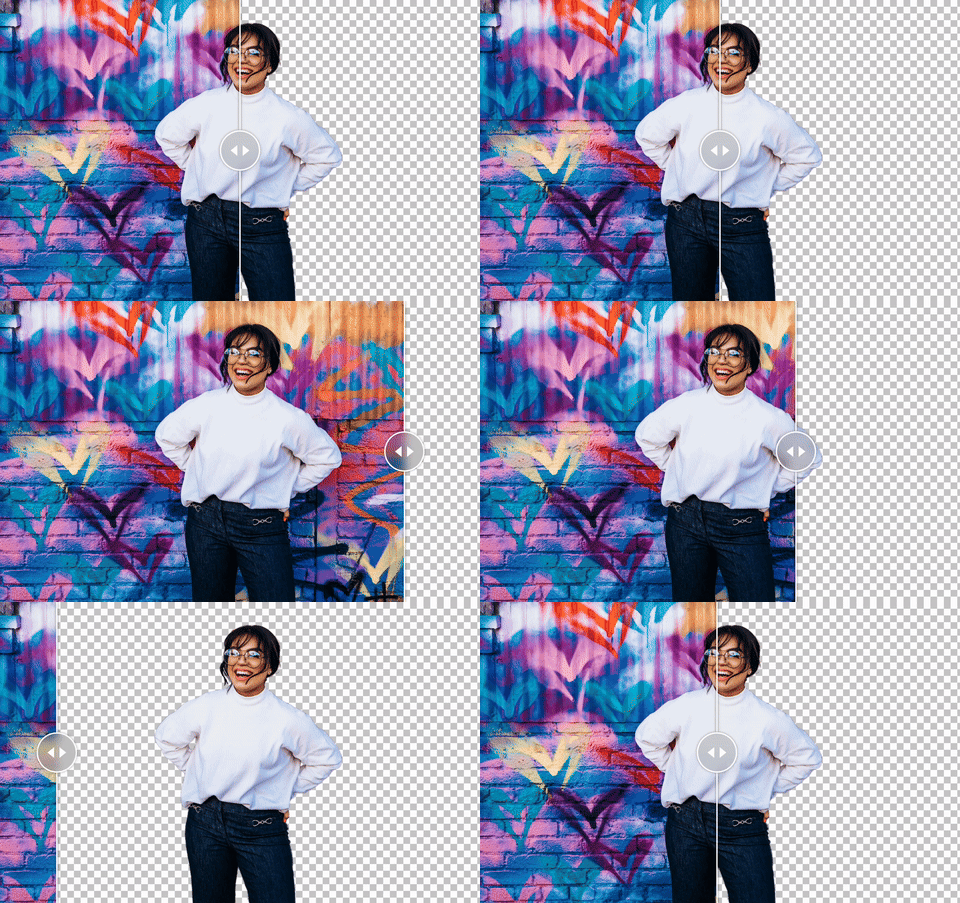
Important
This readme is for the v4 release which is currently in beta (react-compare-slider@beta).
See Version 3 for the latest stable release (react-compare-slider).
- Supports responsive images and any other React components (
picture,video,canvas,iframeetc.) - Supports landscape and portrait orientations
- Accessible – screen reader and keyboard support out of the box
- Simple API
- Unopinionated & fully customizable – optionally use your own components and styles
- Responsive & fluid with intrinsic sizing
- Teeny-tiny, zero dependencies
- Type safe
- Storybook: docs, demos, custom recipes, custom handles,
useReactCompareSliderRef - CodeSandbox: basic demo
- Local example
npm install react-compare-slider
# or
yarn add react-compare-slider
# or
pnpm add react-compare-sliderYou may use ReactCompareSliderImage to render images or use your own custom
components.
import { ReactCompareSlider, ReactCompareSliderImage } from 'react-compare-slider';

export const Example = () => {
  return (
    <ReactCompareSlider
      itemOne={<ReactCompareSliderImage src="..." srcSet="..." alt="Image one" />}
      itemTwo={<ReactCompareSliderImage src="..." srcSet="..." alt="Image two" />}
    />
  );
};| Prop | Type | Required | Default | Description |
|---|---|---|---|---|
boundsPadding |
number |
0 |
Padding to limit the slideable bounds in pixels on the X-axis (landscape) or Y-axis (portrait). | |
browsingContext |
globalThis |
globalThis |
Context to bind events to (useful for iframes). | |
clip |
both|itemOne|itemTwo |
both |
Whether to clip itemOne, itemTwo or both items. |
|
changePositionOnHover |
boolean |
false |
Whether the slider should follow the pointer on hover. | |
disabled |
boolean |
false |
Whether to disable slider movement (items are still interactable). | |
handle |
ReactNode |
undefined |
Custom handle component. | |
itemOne |
ReactNode |
✓ | undefined |
First component to show in slider. |
itemTwo |
ReactNode |
✓ | undefined |
Second component to show in slider. |
keyboardIncrement |
number|`${number}%` |
5% |
Percentage or pixel amount to move when the slider handle is focused and keyboard arrow is pressed. | |
onlyHandleDraggable |
boolean |
false |
Whether to only change position when handle is interacted with (useful for touch devices). | |
onPositionChange |
(position: number) => void |
undefined |
Callback on position change, returns current position percentage as argument. | |
portrait |
boolean |
false |
Whether to use portrait orientation. | |
position |
number |
50 |
Initial percentage position of divide (0-100). |
|
transition |
string |
undefined |
Shorthand CSS transition property to apply to handle movement. E.g. .5s ease-in-out |
API docs for more information.
Checkout out the Real World Examples page.
- React 16.8+
- The latest two versions of each major browser are officially supported (at time of publishing)


