Lightweight and very simple CSS Grid Layout library based on Styled Components for React, Gatsby and
others.
npm i react-styled-grid-layout
import { Grid, Row, Col, Cell } from 'react-styled-grid-layout';
Correct order, everything must be wrapped in <Grid> tag.
<Grid>
    <Col>...</Col>
</Grid><Grid>
<Row>
<Cell>...</Cell>
</Row>
</Grid>
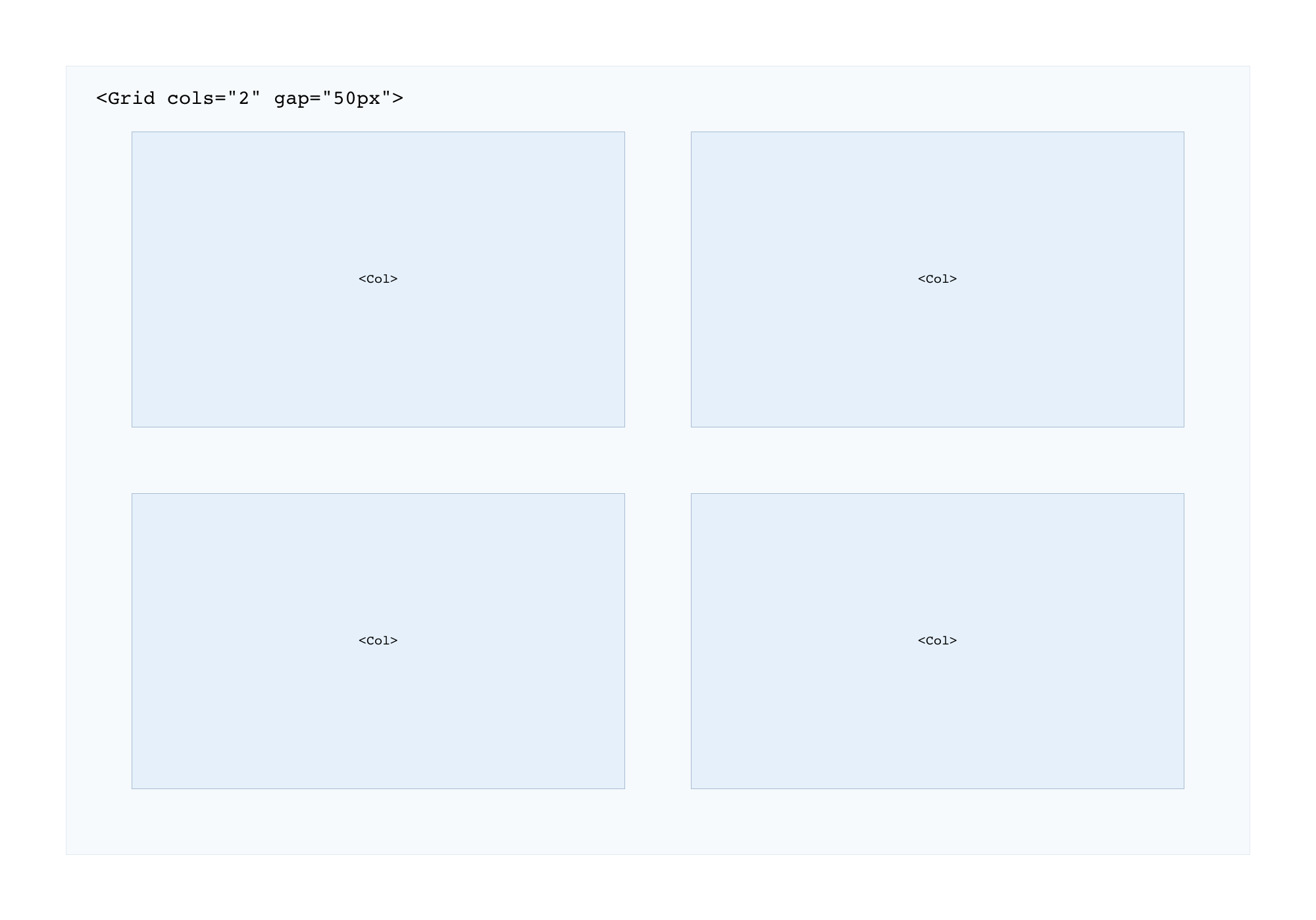
Simple two columns in one row:
<Grid cols="2">
    <Col>...</Col>
    <Col>...</Col>
    <Col>...</Col>
    <Col>...</Col>
</Grid>
Simple four columns grid with media queries and gaps:
<Grid cols="12" gap="10px">
    <Col xxl="3" md="6" sm="12">...</Col>
    <Col xxl="3" md="6" sm="12">...</Col>
    <Col xxl="3" md="6" sm="12">...</Col>
    <Col xxl="3" md="6" sm="12">...</Col>
</Grid>
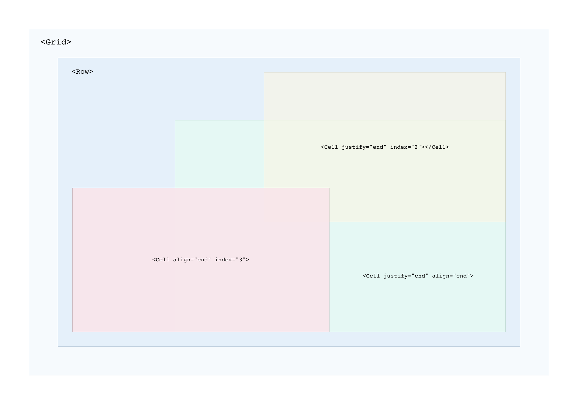
You can easily position content within the <Row> container using align and justify props:
<Grid cols="12" gap="10px">
    <Row height="400px">
        <Cell align="center" justify="center"> Center </Cell>
        <Cell align="center"> Left Center </Cell>
        <Cell align="end" index="2"> Left Bottom </Cell>
    </Row>
</Grid>
React function component example:
import React from 'react';
import { Grid, Row, Col, Cell } from 'react-styled-grid-layout';

const Grids = () => {
  return (
    <>
      <Grid cols="4">
        <Col> 1 </Col>
        <Col> 2 </Col>
        <Col> 3 </Col>
        <Col> 4 </Col>
      </Grid>

      <Grid>
        <Row>
          <Cell> 1 </Cell>
          <Cell> 2 </Cell>
        </Row>
      </Grid>
    </>
  );
};

export default Grids;| Props | CSS | Default | Test |
|---|---|---|---|
rows :number |
grid-template-rows | auto | <Grid rows="1fr auto 100px ..."> |
cols |
grid-template-columns | repeat(12, 1fr) | <Grid cols="12"> |
gap |
grid-gap | 0 | <Grid gap="25px"> |
| Props | Breakpoints | Test |
|---|---|---|
xxl :number |
5120px | <Col xxl="3"> |
xl |
1200px | <Col xl="6"> |
lg |
992px | <Col lg="3"> |
md |
768px | <Col md="12"> |
sm |
576px | <Col sm="12"> |
xs |
320px | <Col xs="12"> |
\
| Props | CSS | Default | Test |
|---|---|---|---|
row :number |
grid-row | auto | <Col row="1"> |
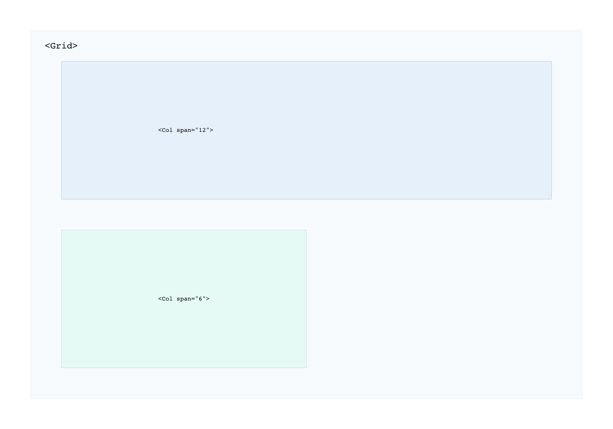
span |
grid-column-end | 1 | <Col span="2"> |
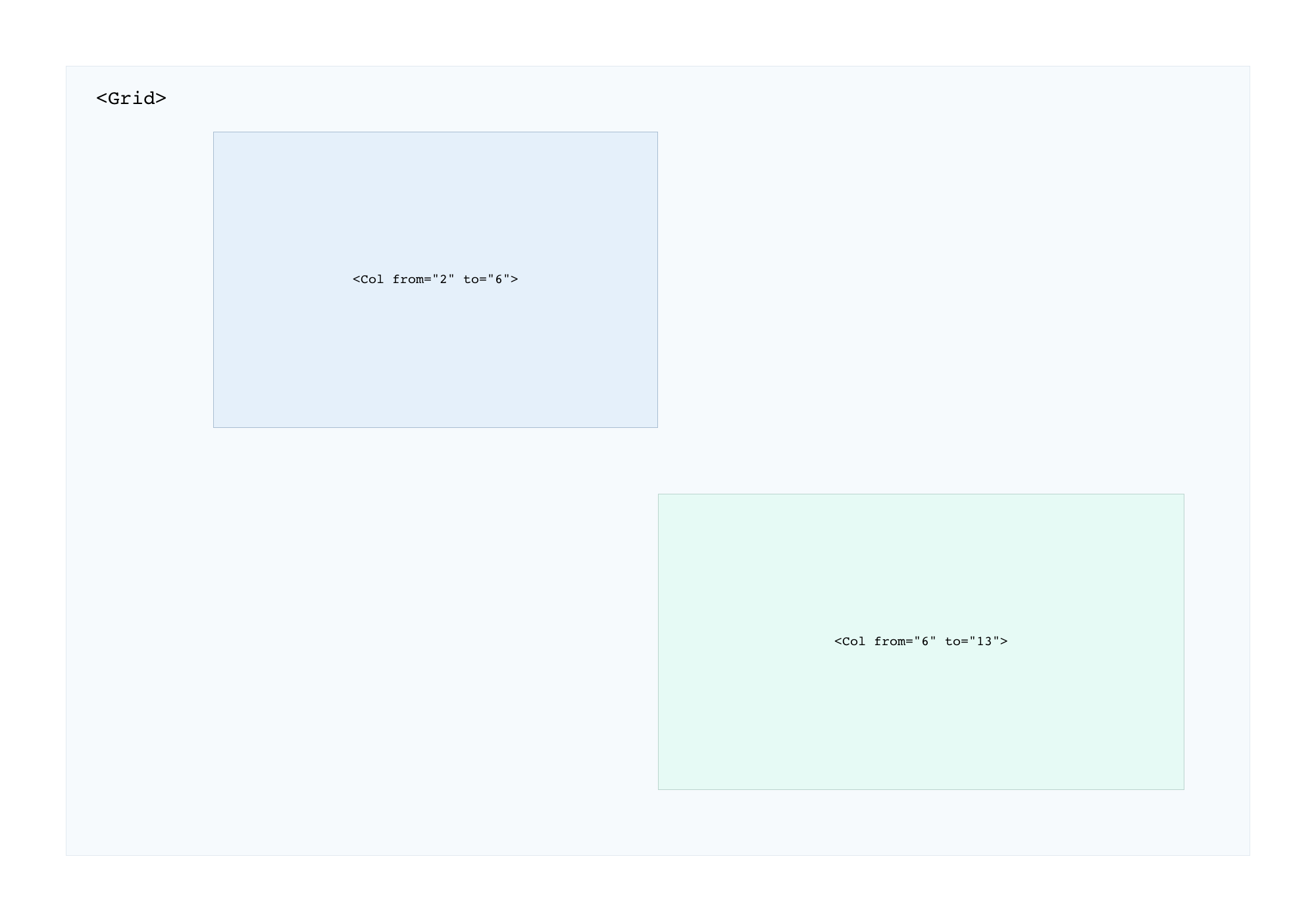
from to |
grid-column: [from] / [to] | none | <Col from="1" to="12"> |
width |
max-width | none | <Col width="50%"> |
height |
min-height | auto | <Col height="500px"> |
align |
align-self: [start, center, end] | start | <Col align="center"> |
justify |
justify-self: [start, center, end] | start | <Col justify="center"> |
text |
text-align: [left, center, right] | left | <Col text="center"> |
| Props | CSS | Default | Test |
|---|---|---|---|
height |
min-height | auto | <Row height="50px"> |
| Props | CSS | Default | Test |
|---|---|---|---|
align |
align-self: [start, center, end] | start | <Cell align="center"> |
justify |
justify-self: [start, center, end] | start | <Cell justify="center"> |
index |
z-index: [num] | 1 | <Cell index="1"> |
width |
max-width | auto | <Cell width="100px"> |
https://github.com/koniecznytomek/react-styled-grid-layout
git clone https://github.com/koniecznytomek/react-styled-grid-layout
https://react-styled-grid-layout.netlify.app/