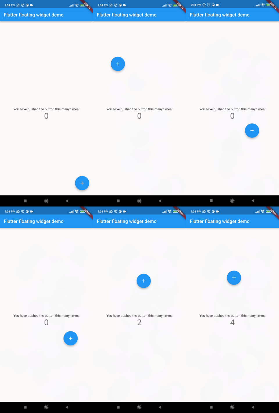
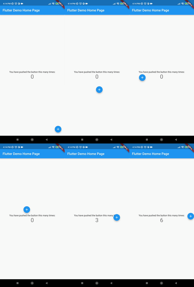
- Support Android, IOS, Web etc.
- This package is used to make a widget movable or draggable around the screen freely;
- Works fine for any Widget;
- Does not affect the functionality or performance of the particular widget;
- Used physics law supported animation to make it more attractive;
Without auto align Initially "autoAlign" is false.
autoAlign = false
Auto align activated Add this to your code.
autoAlign = true
Deletion of the widget Add this to your code.
deleteWidget: Icon(Icons.cancel),
add this in your pubspec.yaml
floating_draggable_widget: ^leatest_version
This is the constructor fo the class.
     FloatingDraggableWidget({
        required this.child,
        required this.floatingWidget,
        required this.floatingWidgetWidth,
        required this.floatingWidgetHeight,
        required this.dy,
        required this.dx,
        this.screenHeight,
        this.screenWidth,
        this.speed,
        this.isDraggble = true,
        this.autoAlign = false,
        this.deleteWidgetAlignment = Alignment.bottomCenter,
        this.deleteWidgetAnimationDuration = 200,
        this.hasDeleteWidgetAnimationDuration = 300,
        this.deleteWidgetAnimationCurve = Curves.easeIn,
        this.deleteWidgetHeight = 50,
        this.deleteWidgetWidth = 50,
        this.isCollidingDeleteWidgetHeight = 70,
        this.isCollidingDeleteWidgetWidth = 70,
        this.deleteWidgetDecoration,
        this.deleteWidgetPadding = const EdgeInsets.only(bottom: 8),
    });
- Child is required and it accept any widget. This is actually the base Widget or the parent widget on where the floating widget will be dragged or moved.
- floatingWidget is also required and it accept any widget. This is actually the particular widget which will be floated and can be mode or dragged around the screen.
- floatingWidgetWidth is also required and it accepts a double value which is the width of the floating widget above mentioned.
- floatingWidgetHeight is also required and it accepts a double value which is the height of the floating widget above mentioned.
- dy accepts a double value which is the distance from the top of the screen where floating widget will be positioned initially .
- dx it accepts a double value which is the distance from the left of the screen where floating widget will be positioned initially.
- screenHeight accepts a double value which is the height of the screen initially.
- screenWidth accepts a double value which is the width of the screen initially.
- speed accepts a double value which is the speed factor of the floating widget after it will be let go. The more speed will be provided the slower the object will move after the user let the widget go freely.
- isDraggable accepts a boolean value which determines if the widget is draggable of not.
- autoAlign accepts a boolean value which determines if the widget will be auto aligns on the left or right after it is being dragged.
- deleteWidget accepts a widget which is used to delete the floating widget.
- onDeleteWidget accepts a function which is used to delete the floating widget.
- deleteWidgetAlignment accepts an alignment value which is used to align the delete widget.
- deleteWidgetAnimationCurve accepts an animation curve value which is used to animate the delete widget.
- deleteWidgetAnimationDuration accepts an animation duration value which is used to animate the delete widget
- hasDeleteWidgetAnimationDuration accepts an animation duration value which is used to animate the delete widget when it is dragging with the delete widget.
- deleteWidgetHeight accepts a double value which is used to set the height of the delete widget.
- deleteWidgetWidth accepts a double value which is used to set the width of the delete widget.
- isCollidingDeleteWidgetHeight accepts a double value which is used to set the height of the delete widget.
- isCollidingDeleteWidgetWidth accepts a double value which is used to set the width of the delete widget.
- boxDecoration optionally accepts a box decoration value which is used to set the decoration of the delete widget.
- deleteWidgetPadding optionally accepts a padding value which is used to set the padding of the delete widget.
import 'package:flutter/material.dart';
import 'package:floating_animated_widget/floating_draggable_widget.dart';
void main() {
  runApp(const MyApp());
}

class MyApp extends StatelessWidget {
  const MyApp({Key? key}) : super(key: key);

  // This widget is the root of your application.
  @override
  Widget build(BuildContext context) {
    return MaterialApp(
      title: 'Flutter Demo',
      theme: ThemeData(

        primarySwatch: Colors.blue,
      ),
      home: const MyHomePage(title: 'Flutter Demo Home Page'),
    );
  }
}

class MyHomePage extends StatefulWidget {
  const MyHomePage({Key? key, required this.title}) : super(key: key);

  final String title;

  @override
  State<MyHomePage> createState() => _MyHomePageState();
}

class _MyHomePageState extends State<MyHomePage> {
  int _counter = 0;

  void _incrementCounter() {
    setState(() {

      _counter++;
    });
  }

  @override
  Widget build(BuildContext context) {

    return FloatingDraggableWidget(
      child: Scaffold(
        appBar: AppBar(

          title: Text(widget.title),
        ),
        body: Center(

          child: Column(

            mainAxisAlignment: MainAxisAlignment.center,
            children: <Widget>[
              const Text(
                'You have pushed the button this many times:',
              ),
              Text(
                '$_counter',
                style: Theme.of(context).textTheme.headline4,
              ),
            ],
          ),
        ),
      ),
      floatingWidget: FloatingActionButton(
        onPressed: _incrementCounter,
        tooltip: 'Increment',
        child: const Icon(Icons.add),
      ),
      floatingWidgetHeight: 40,
      floatingWidgetWidth: 40,
      dx: 200,
      dy: 300
    );
  }
}
- Doesn't have functionality of floating on other apps.
- It dose not automatically calculate the size of the parent widget it always take the whole screen to float around.
- It dose not automatically calculate the size of the floating widget


