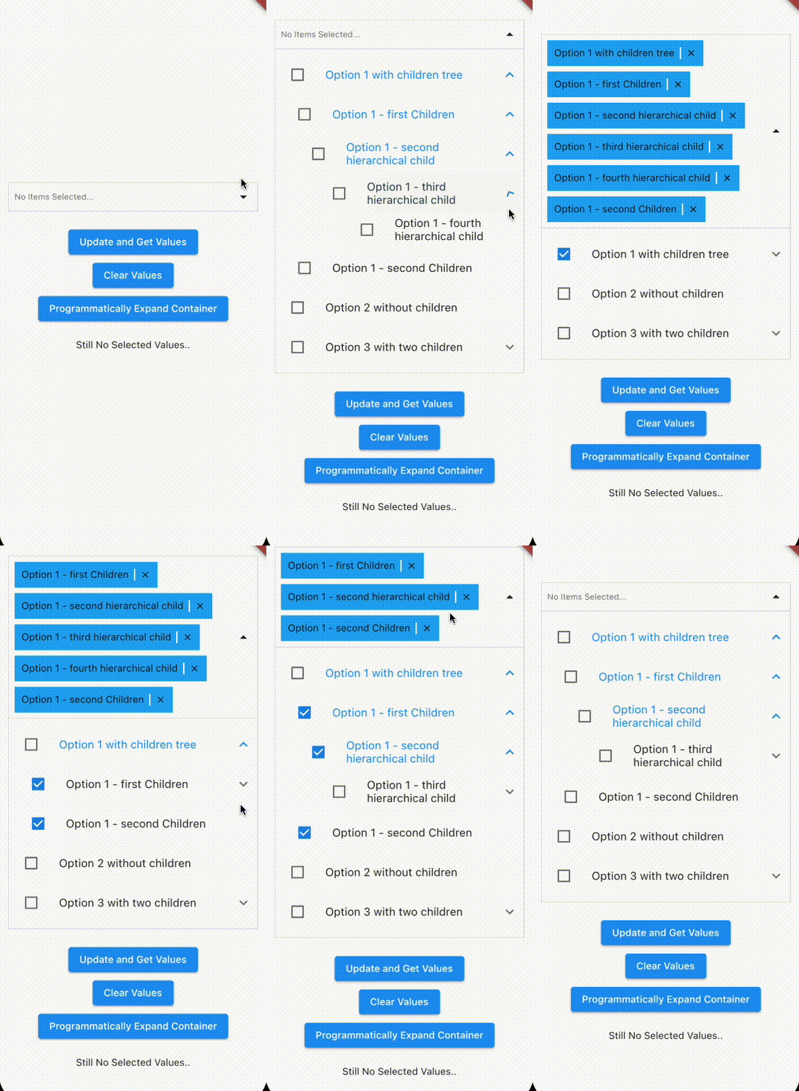
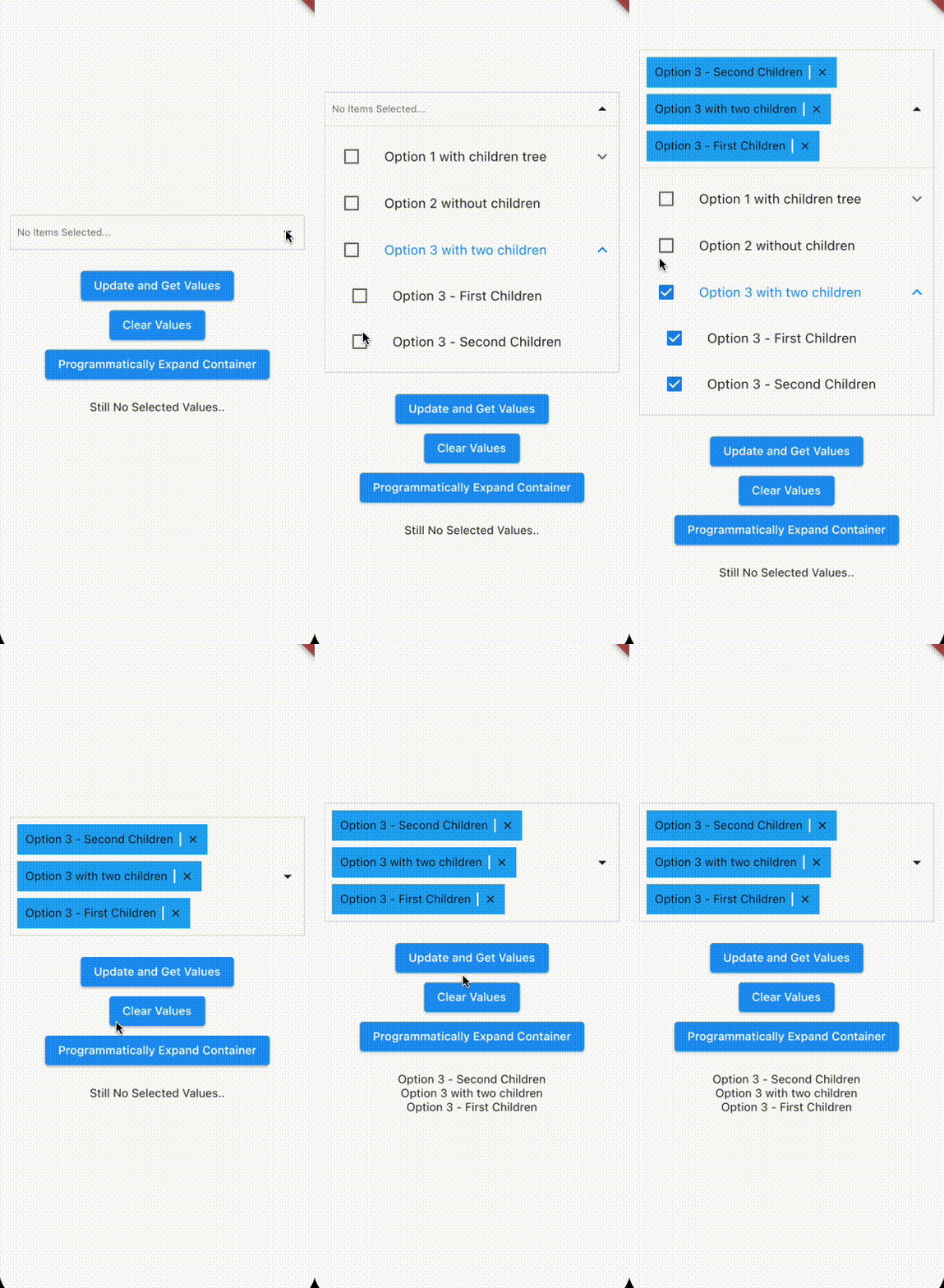
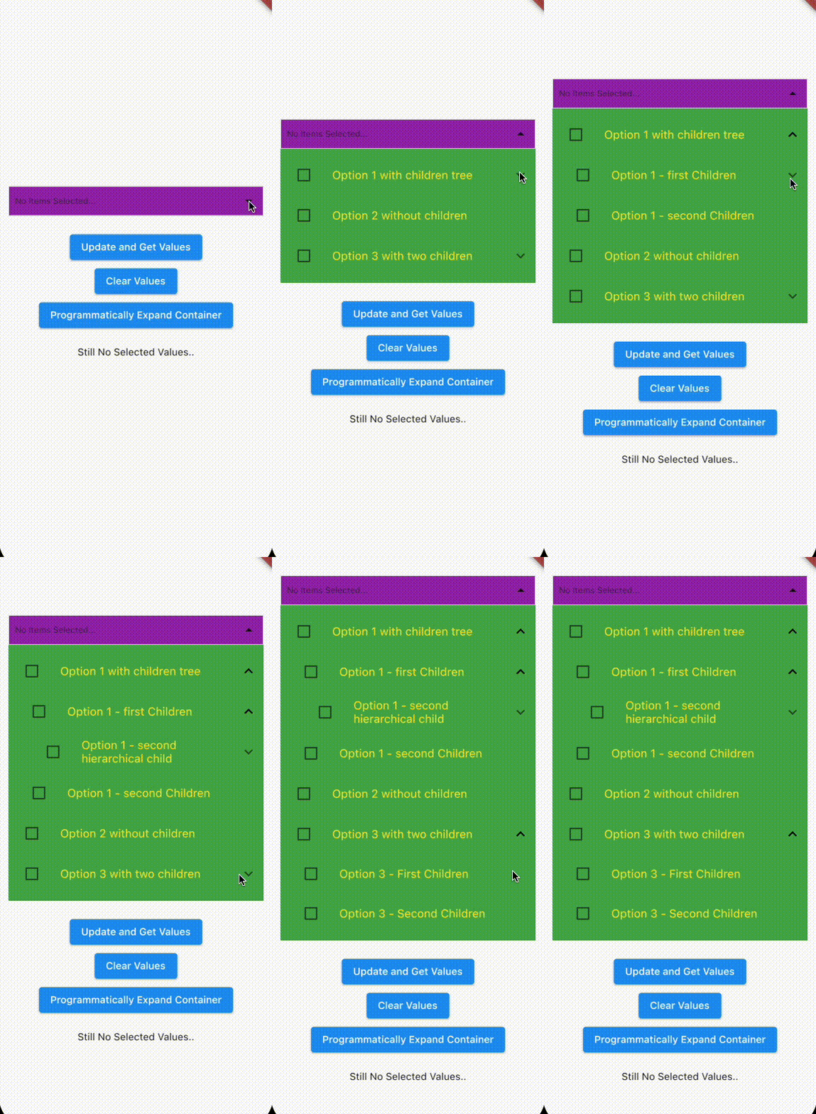
Multi Select Nested is a package with nested options support for Flutter.
 General Use |
 Ready-to-use controller |
 Pass AnimatedContainer: true to use animations |
 Fully customizable |
|---|
- Single & multiple select with nested options support
- Rich options & highly customizable
add it to pubspec.yaml
dependencies:
  flutter:
    sdk: flutter
  multiselect_nested: # use latest version
Import the library
import 'package:multiselect_nested/multiselect_nested.dart';If you want you can create a MultiSelectNestedController to pass as a prop
import 'package:multiselect_nested/models/multiselect_nested.dart';

MultiSelectNestedController multiSelectController = MultiSelectNestedController();
You can also import the Model: multiselect_nested_item , helpful to use the correct interface when passing the options and the pre-selected items to the library
import 'package:multiselect_nested/models/multiselect_nested_item.dart';Add the MultiSelectNested widget to your method
import 'package:multiselect_nested/multiselect_nested.dart';
import 'package:multiselect_nested/models/multiselect_nested_item.dart';
import 'package:multiselect_nested/models/multiselect_nested_controller.dart';

List<MultiSelectNestedItem> options = [
    MultiSelectNestedItem(
      id: 1,
      name: 'Option 1',
      children: [],
    ),
    MultiSelectNestedItem(
      id: 2,
      name: 'Option 2 ',
      children: [],
    ),
  ];
List<MultiSelectNestedItem> selected = [];
MultiSelectNestedController multiSelectController = MultiSelectNestedController();

MultiSelectNested(
    controller: multiSelectController,
    options: options,
    selectedValues: selected,
    setSelectedValues:
        (List<MultiSelectNestedItem> newValues) {
      setState(() {
        selected = newValues;
      });
    },
),.
.
.
List<MultiSelectNestedItem> selected = [];
MultiSelectNestedController multiSelectController = MultiSelectNestedController();
Future<List<MultiSelectNestedItem>> getJson() async {
var data = await rootBundle.loadString('assets/example_data.json');
return multiSelectItemsFromJson(data);
}
FutureBuilder<List<MultiSelectNestedItem>>(
future: getJson(),
builder: (BuildContext context,
AsyncSnapshot<List<MultiSelectNestedItem>> snapshot) {
switch (snapshot.connectionState) {
case ConnectionState.waiting:
return const Text('Loading....');
default:
if (snapshot.hasError) {
return Text('Error: ${snapshot.error}');
} else {
return Column(
children: [
MultiSelectNested(
controller: multiSelectController,
options: snapshot.data!,
selectedValues: selected,
setSelectedValues:
(List<MultiSelectNestedItem> newValues) {
setState(() {
selected = newValues;
});
},
),
],
);
}
}
},
),
.
.
.| Parameter | Type | Description |
|---|---|---|
options |
List< MultiSelectNestedItem > | The options which a user can see and select. |
selectedValues |
List< MultiSelectNestedItem > | Preselected options. |
setSelectedValues |
Function(List< MultiSelectNestedItem >)? | Callback to pass the selectedValues to the parent. It's triggered when you add or remove elements from the selected items. Only works with the liveUpdateValues set to true |
liveUpdateValues |
bool | Set to true if you want a live update of the values. Be careful because it will trigger e rebuild on every added or removed element from the selectedValues which remove the smooth effect from the dropdown container. |
checkParentWhenChildIsSelected |
bool | Add a partial check to the parent when one of his child is selected. Be careful this works only with not multi hierarchical child |
controller |
MultiSelectNestedController | Use this controller to get access to internal state of the Multiselect. |
paddingDropdown |
EdgeInsets | Padding Dropdown content. |
paddingSelectedItems |
EdgeInsets | Padding Row Selected Items. |
isAnimatedContainer |
bool | Set to true to use an Animated container which can accept Curve's effects. |
effectAnimatedContainer |
Curve | Customize the effect of the animated container. |
durationEffect |
Duration | Duration of the Effect of the Animated Container. |
heightDropdownContainer |
double | Height of the Animated Container. This value is only read with the Animated Container set to true because it requires a specific height to work. If it is not set, will be used the default height as value. |
heightDropdownContainerDefault |
Duration | Overwrite the default height of the animated container. |
dropdownContainerColor |
Color | Background Color of the Collapsible Dropdown. |
selectedItemColor |
Color | Background Color of the Selected Items. |
selectedItemDividerColor |
Color | Color of the divider between the selected items. |
collapsedIconColor |
Color | Color of icon when items are collapsed. |
selectedItemsRowColor |
Color | Color of the row of the selected items. |
noItemsText |
String | Text to display in case of no items are provided. |
noItemsTextStyle |
TextStyle | Text Style of noItemsText. |
styleDropdownItemName |
TextStyle | Text Style of the labels inside the dropdown. |
. . .
Pull requests are always welcome. Please open an issue first to discuss what you would like to change.
The Next Releases will implement these features.
- Async searching
- Delayed loading (load data of deep level options only when needed)
Stay Tuned!